Joe Maring / Android Authority
It’s been just about a week since Google launched Android 17 Beta 1, and as you’ve probably heard by now, it’s not a particularly big update. While we expect more new features in later beta versions, Beta 1 is pretty light on user-facing changes.
However, that doesn’t mean there isn’t anything cool in this first beta release.
I’ve been testing Android 17 Beta 1 on one of my Pixels, and there are already two features I desperately miss whenever I go back to a phone running Android 16.
What’s your favorite thing about Android 17 Beta 1?
42 votes
Removing the At a Glance home screen widget

Joe Maring / Android Authority
At a Glance is one of my favorite Pixel features. Looking at my lock screen and seeing information like the weather, upcoming calendar appointments, flight info, and ongoing timers — all without unlocking my phone — is immensely helpful (especially when using the always-on display).
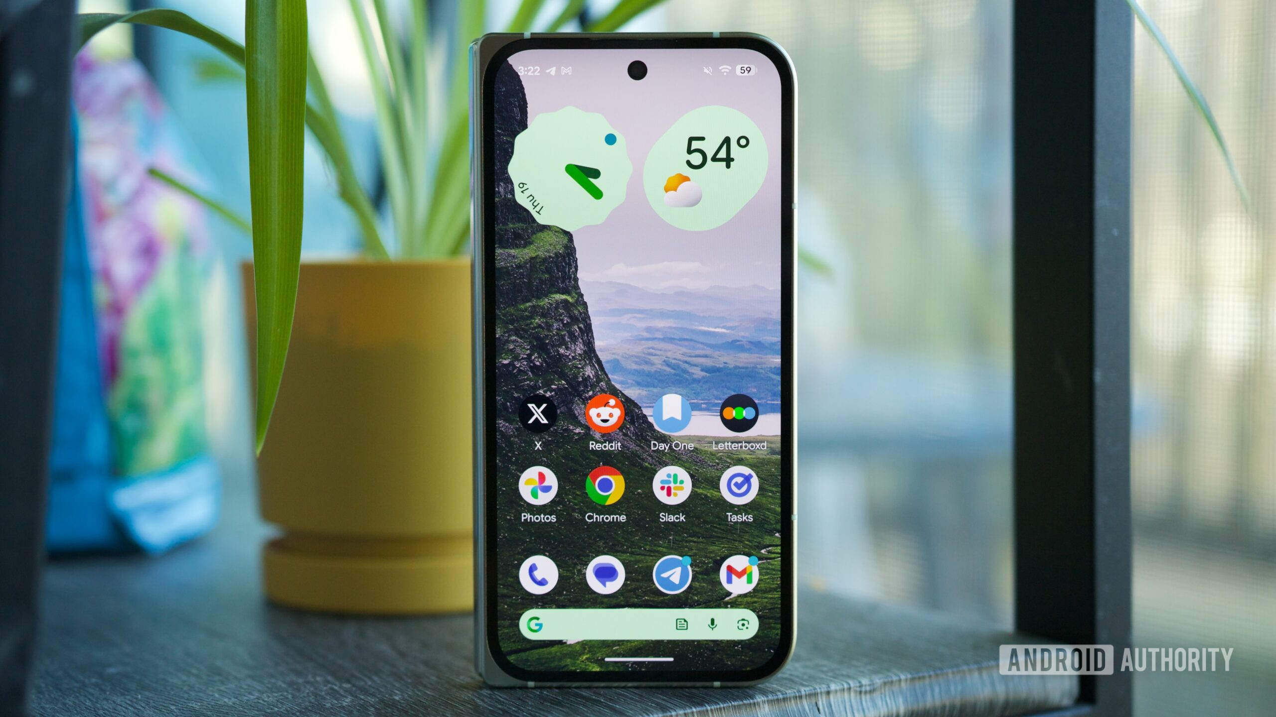
However, I find At a Glance’s placement on the home screen extremely annoying. It’s not that the information is less useful, but having a persistent widget at the top of my home screen — one I can’t move or get rid of — has always been a thorn in the Pixel home screen experience.
In Android 17 Beta 1, there’s finally a solution to this: you can remove At a Glance from the home screen, freeing up an additional row of space for apps and widgets. It might not sound like much, but it goes a long way in letting you decide how to use that space. You can keep At a Glance on the home screen if you prefer, but the important thing is that you now get to decide rather than having Google decide for you. And, importantly, removing At a Glance from the home screen doesn’t impact it on the lock screen at all.
It’s worth noting that some users had access to this setting in Android 16 QPR3 Beta 1, though it appears to be more widely available in Android 17 Beta 1. And, without a doubt, it’s been a highlight of my Android 17 Beta experience so far.
Google Search bar customization options

Joe Maring / Android Authority
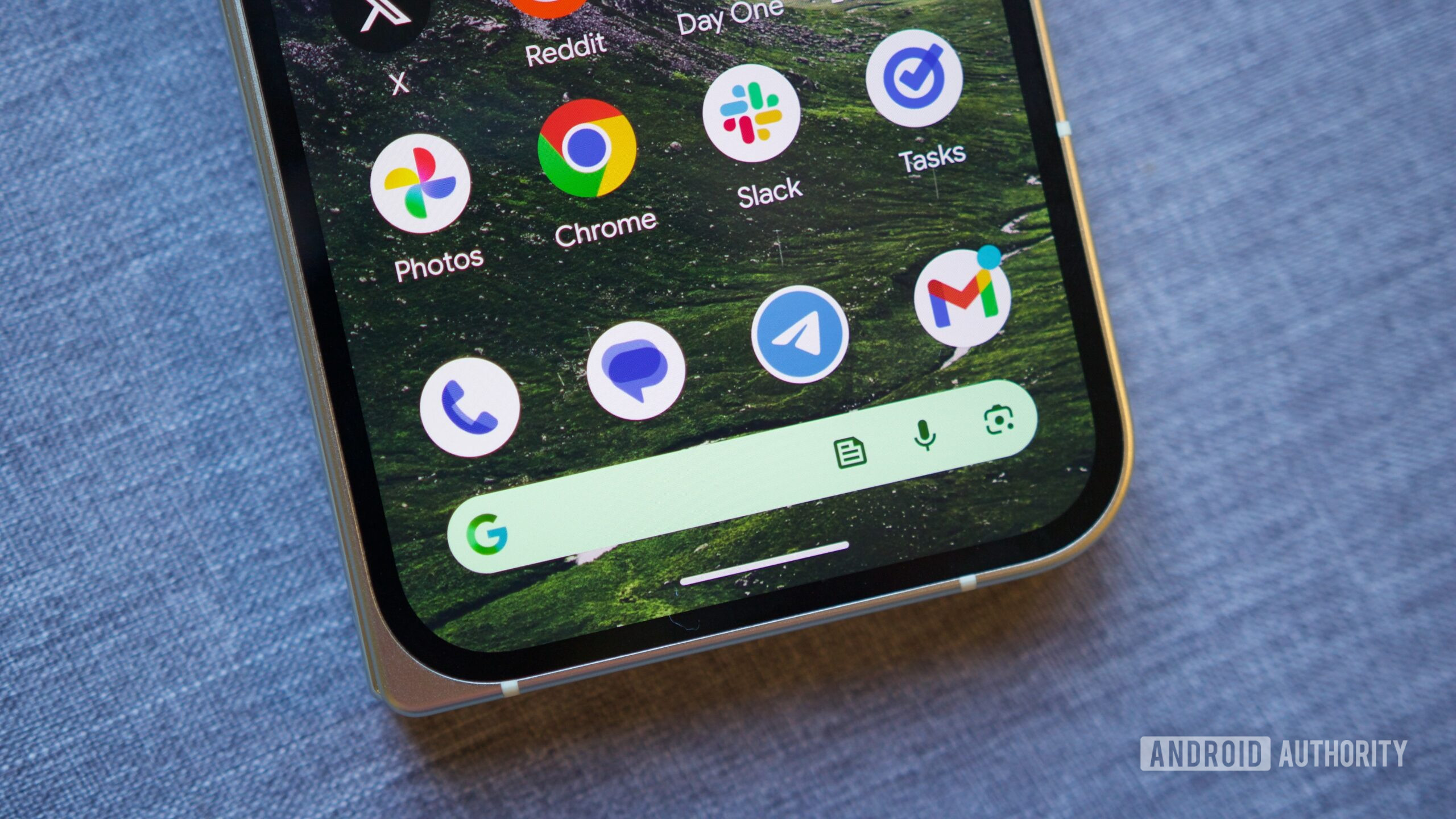
In Android 17, if you press and hold on the Google Search bar at the bottom of the home screen, you can tap a new “Widget settings” button to customize the search bar to your exact liking. This includes options for the search bar’s theme (including full custom colors), its transparency, and even its shortcut.
In the week I’ve been using Android 17 Beta 1, I haven’t quite decided which shortcut I want to stick with. The News shortcut has been nice for quickly checking the news with just a tap, though I’ve also found the Saved shortcut quite handy. I may also just disable it and keep my search bar a little less cluttered. Whatever I ultimately decide on, having that freedom of choice has been incredible.
These customization options have previously been available for the standard Google Search widget, though they’ve never been supported by the Google Search bar on the Pixel home screen. This discrepancy never really made sense, and it’s wonderful to have that corrected in Android 17 Beta 1.
We’re just getting started
If you’ve been let down by what we’ve seen from Android 17 Beta 1 so far, it’s worth reiterating that a lot more is on the horizon. We know Google is working on a controversial split design for the notification panel and Quick Settings. A universal clipboard should arrive at some point, as should a very cool App Lock feature. And that’s to say nothing of other features that haven’t leaked yet. Simply put, there’s still a lot to look forward to with Android 17.
But even at this point with Android 17 Beta 1, I’m quite happy with what we’ve seen so far. Between the At a Glance and Google Search bar changes, Android 17 has already addressed two longstanding complaints — and I’m thrilled with both of them.
Thank you for being part of our community. Read our Comment Policy before posting.
First Appeared on
Source link


Leave feedback about this