Stephen Headrick / Android Authority
If I wanted Liquid Glass, I’d buy an iPhone. It doesn’t belong on Android. And yet, I’m seeing more and more of Apple’s design language — or half-baked versions of it — pop up in apps on my Google Pixel.
Android has long been known for its customization options. For that reason, I don’t mind some of the third-party launchers that have added Liquid Glass-like design packs. For me, the issue is not about a third-party developer giving the user the option; to the contrary, the issue is when an app developer chooses Apple’s design language over Google’s Material 3 Expressive as the default, leading to an experience that feels foreign.
Have you noticed Liquid Glass design in apps you use on Android?
190 votes
There are levels to this

Stephen Headrick / Android Authority
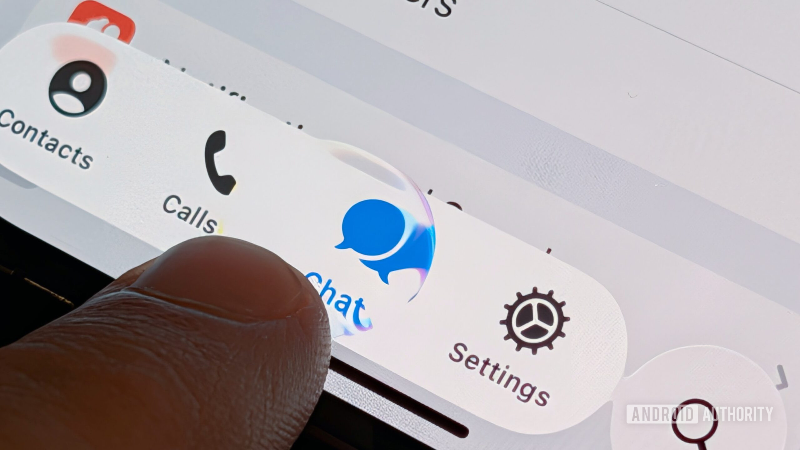
Some apps are leaning on Liquid Glass more than others. The most recent and blatant implementation I’ve seen is in popular note-taking app Obsidian. This app was recently updated and the UI screams iOS. The circular floating buttons at the top right and left of each screen, the floating bar at the bottom, the lack of color — it’s all straight from iOS. To give credit where it’s due, I will admit that the app feels native and snappy to use, but I would appreciate even just a little effort to make the experience more fit for Android.
In Obsidian’s case, even just a couple of small changes would go a long way. For one, to differentiate from Apple’s design standards, I’d start by changing the two floating buttons at the top of the screen. Taking some inspiration from Google’s Screenshots app, I’d change the buttons’ shape to more of a squished circle, with a narrower top and bottom and longer sides. I’d also remove the shadows from underneath the circle and leave them flat, as you commonly see with these buttons on Android.

Stephen Headrick / Android Authority
Google’s design language does a great job at incorporating colors of your choice throughout the UI, and app developers can also take advantage of this. With Obsidian, I would love to see the option to apply my device’s Material You color system to the app’s UI. Those buttons could use the same color theming I see in other apps that properly implement this, such as Gmail and Google Messages. I tend to change my device’s color system once a month — usually correlating to a season like summer or fall or to that month’s biggest holiday — and I love seeing those colors throughout the apps I use. Material You, when implemented properly, does a great job using these colors as accents and in the right places so that it’s pleasant and not overwhelming to look at.
I see elements of Liquid Glass and a proprietary design system, mixed into one hodgepodge of an app.
Telegram is another hugely popular app that can’t decide if it wants to use Liquid Glass or something else that is definitely not Material design. It recently released an overhauled design of its Android app that, at first glance, looks like a watered-down version of the iOS version, but upon deeper inspection, it gets even worse. Personal chats still have Telegram’s old design at the top of the screen, while the top bar in channels — Telegram’s one-to-many broadcast option — now seemingly resembles iOS design language.

Stephen Headrick / Android Authority
Telegram is usually a design-forward company, with beautiful animations and a well-designed user experience, and while the animations are still top-notch, this mixture of Liquid Glass and other design choices is a bit disappointing to me. If a company wants to create its own design system, that’s fine. In that case, you don’t have to use Apple or Google’s systems. With Telegram on Android, we’re not seeing either of those options, but rather a mix of the two. I see elements of Liquid Glass and a proprietary design system, mixed into one hodgepodge of an app. The app works, but the experience is distinctly not Android.
Have it your way, but go all-in

Stephen Headrick / Android Authority
As I alluded to, I’m alright with a company designing its own UI. This can help a company keep its brand identity uniform across all the platforms it operates on. A good example of this is Robinhood. You won’t find any bits of Liquid Glass or Material 3 Expressive in its apps, but you will see a consistent design system that you can count on from Robinhood, no matter where you’re accessing it from.
I feel like I’m using a wanna-be iPhone app on my Android phone.
Usually, developing a custom design system like Robinhood’s requires a lot of resources, which is why many developers choose to use components provided in a platform’s native tooling. In the case of Telegram, although it’s not a small developer by any means, it still chose to use some native tooling, but it’s completely lacking in consistency on Android. I feel like I’m using a wanna-be iPhone app on my Android phone. Meanwhile, its iPhone app was quickly updated to adhere to Liquid Glass guidelines and animations.
Don’t want to miss the best from Android Authority?
I get it, these apps are businesses, businesses like to save money where they can, and using only one design across multiple platforms is definitely a cost-cutter. All I’m asking for is a little more love for the Android side. When Google announced Material 3 Expressive, it showed off some extremely bold ideas for what apps might look like with the evolved design language. We’re approaching a year since that announcement, and I don’t see anything remotely close to what Google showcased, even from Google itself. Material 3 Expressive has so much potential, and I really don’t want it to go to waste.
Thank you for being part of our community. Read our Comment Policy before posting.
First Appeared on
Source link


Leave feedback about this